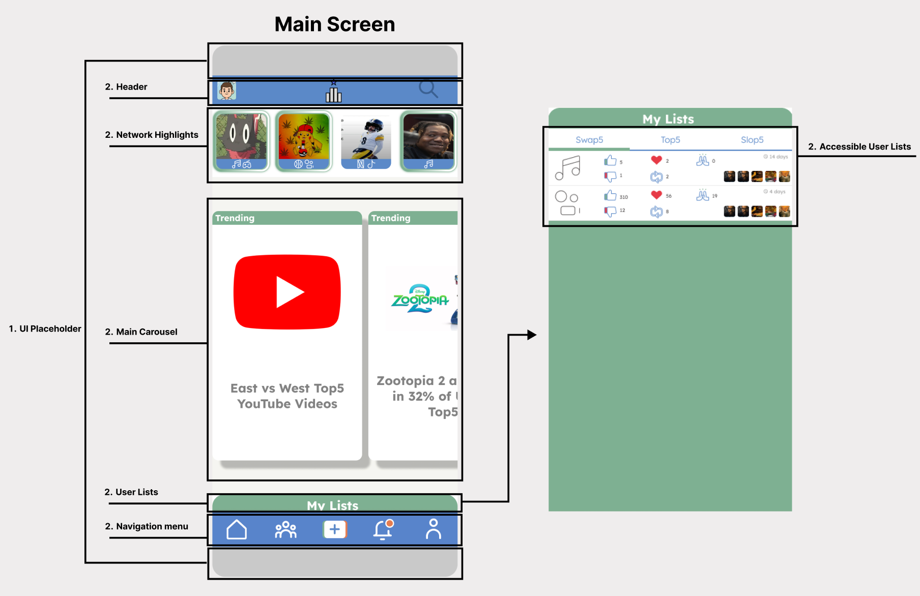
Overview
Role:
UX/UI Designer
Timeline:
2-Weeks
Tools:
Figma, Competitive Analysis, User Research Frameworks
Deliverables:
Research documentation, wireframes, high-fidelity prototypes (v0.1 & v0.2), design system
Summary:
This self-initiated project demonstrates end-to-end UX design methodology, from competitive analysis of 17 apps and cognitive framework development through four design iterations and a complete, scalable design system.
Top5 is a social recommendation platform that applies cognitive psychology and constraint-based design to solve media discovery paralysis through trusted peer networks rather than algorithmic engagement.

The Challenge
Problem Statement:
How might we help users discover quality media recommendations through trusted connections rather than algorithmic feeds that prioritize engagement over authenticity?
How might we help users discover quality media recommendations through trusted connections rather than algorithmic feeds that prioritize engagement over authenticity?
Common User Pain Points:
- Overwhelmed by algorithmic recommendations lacking personal context
- Existing platforms excel at either community or personal connection—rarely both
- Decision paralysis from infinite content options
- Disconnection from friends' genuine recommendations
Business Opportunity:
Create a blue ocean product that combines intimate friend networks with community engagement while avoiding exploitative social media patterns.
Create a blue ocean product that combines intimate friend networks with community engagement while avoiding exploitative social media patterns.
Competitive Analysis
Analyzed: 16 Apps Across 3 Categories
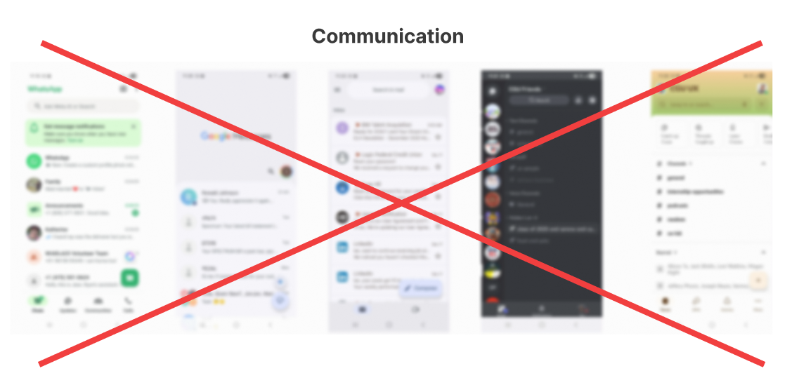
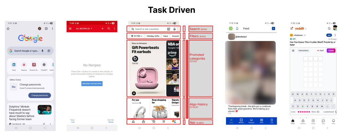
- Task-Driven Apps (Amazon, Reddit, Chrome, Anchovy, Paprika Recipe Manager)
- Communication Apps (WhatsApp, Google Messages, Gmail, Discord, Slack)
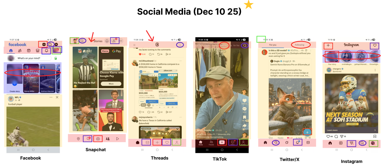
- Social Media Apps (Instagram, TikTok, Threads, Twitter, Facebook, Snapchat)
- Communication Apps (WhatsApp, Google Messages, Gmail, Discord, Slack)
- Social Media Apps (Instagram, TikTok, Threads, Twitter, Facebook, Snapchat)
Key Findings:
- Communication Apps: limit visual discovery through vertical threading, unsuitable for media recommendations that rely on cover art, posters, and visual appeal.
- Social Media: navigation patterns are universally consistent: 5-icon bottom nav, Story Trays, centered logos, right-aligned search.
- Mental Models Matter: Users expect profile access in rightmost nav position, creation tools in center
- Social Media: navigation patterns are universally consistent: 5-icon bottom nav, Story Trays, centered logos, right-aligned search.
- Mental Models Matter: Users expect profile access in rightmost nav position, creation tools in center
Decision:
- Communication Design: Immediately eliminated due to media preview and visual limitations.
- Task-driven Design: Eliminated after consideration since they excel at efficiency and organization, but they lack the interpersonal warmth
- Final Thoughts: Leverage familiar social media patterns to reduce friction while differentiating through content philosophy and constraint-based design.
- Task-driven Design: Eliminated after consideration since they excel at efficiency and organization, but they lack the interpersonal warmth
- Final Thoughts: Leverage familiar social media patterns to reduce friction while differentiating through content philosophy and constraint-based design.
User Insights & Cognitive Framework
Design Principles Leveraged:
Social Proof: Users trust peer-endorsed content over algorithmic suggestions
Paradox of Choice: Limiting to 5 items prevents decision paralysis
Reciprocity: Receiving great recommendations motivates users to contribute their own
Zeigarnik Effect: Incomplete tasks (via progress trackers) encourage completion
Loss Aversion (Positive): Time-limited content creates healthy urgency without toxic FOMO
Harmful Patterns Avoided:
Variable Ratio Reinforcement: No endless feeds designed for doomscrolling
Neuroticism Exploitation: No outrage-inducing or comparison-based content
Filter Bubbles: Algorithmic exploration prioritized over exploitation
Neuroticism Exploitation: No outrage-inducing or comparison-based content
Filter Bubbles: Algorithmic exploration prioritized over exploitation
Ideation & Design Iterations
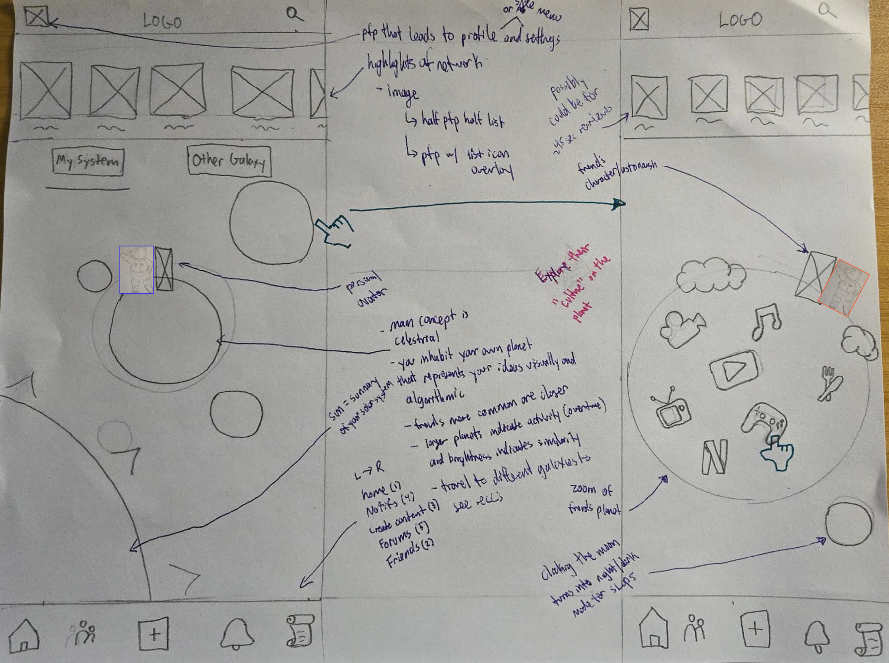
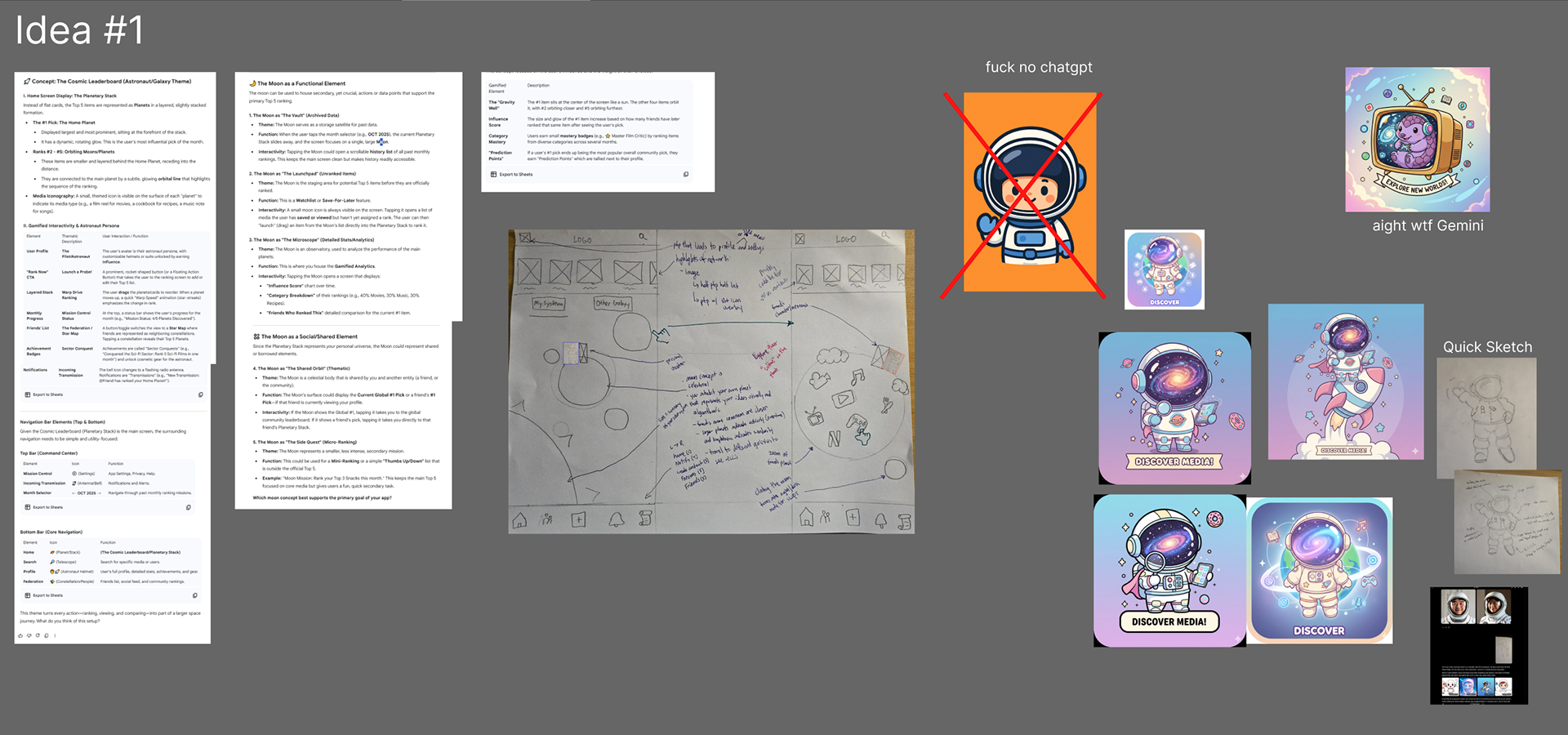
Iteration 1: Space Race (High Complexity)
Concept: Immersive space exploration with planets as profiles, galaxies as networks
Learning: Too complex for MVP; budget and technical constraints eliminated viability
Insight: Metaphor was powerful but execution barrier too high.
Learning: Too complex for MVP; budget and technical constraints eliminated viability
Insight: Metaphor was powerful but execution barrier too high.
Iteration 2: Deck of Cards (Medium Complexity)
Concept: Card-trading mechanics with collectible, upgradeable recommendations
Learning: Strong visual metaphor but required development expertise beyond team capability
Insight: Gamification desire validated; simpler implementation needed
Learning: Strong visual metaphor but required development expertise beyond team capability
Insight: Gamification desire validated; simpler implementation needed
*no wireframe drawn
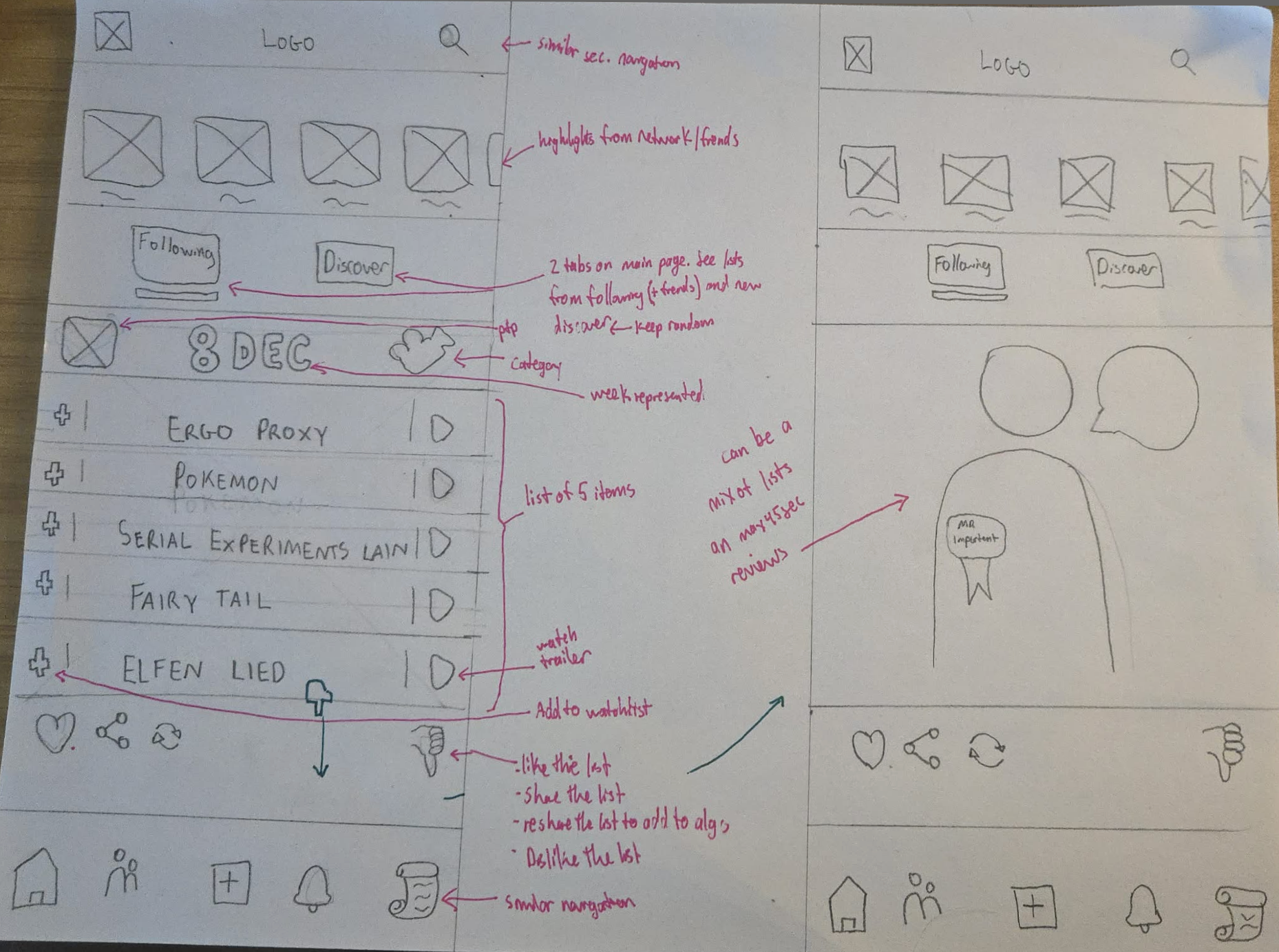
Iteration 3: Full Social Media (Vertical Carousel)
Concept: Instagram-style vertical feed with Story Tray
Learning: One list at a time created poor engagement-to-effort ratio
Insight: Lists can be scanned in seconds—vertical scrolling created excessive friction
Learning: One list at a time created poor engagement-to-effort ratio
Insight: Lists can be scanned in seconds—vertical scrolling created excessive friction
Iteration 4: Task-Driven (Amazon-Inspired)
Concept: Horizontal carousels (70/30 split) for Discovery + Network Updates
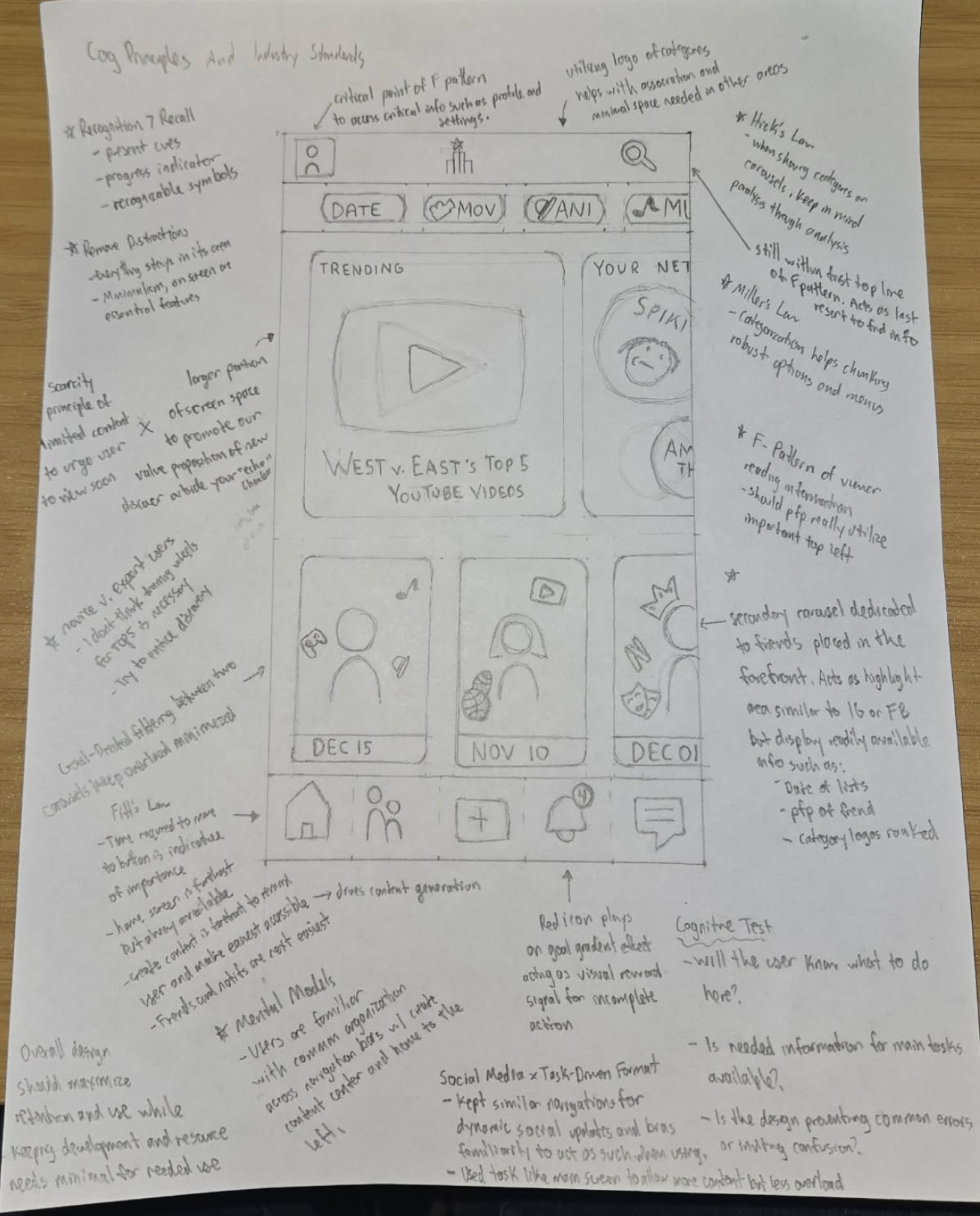
Validation: Cognitive principles confirmed design (Hick's Law, Miller's Law, F-Pattern reading)
Success: Multiple options visible simultaneously; users control consumption
Validation: Cognitive principles confirmed design (Hick's Law, Miller's Law, F-Pattern reading)
Success: Multiple options visible simultaneously; users control consumption
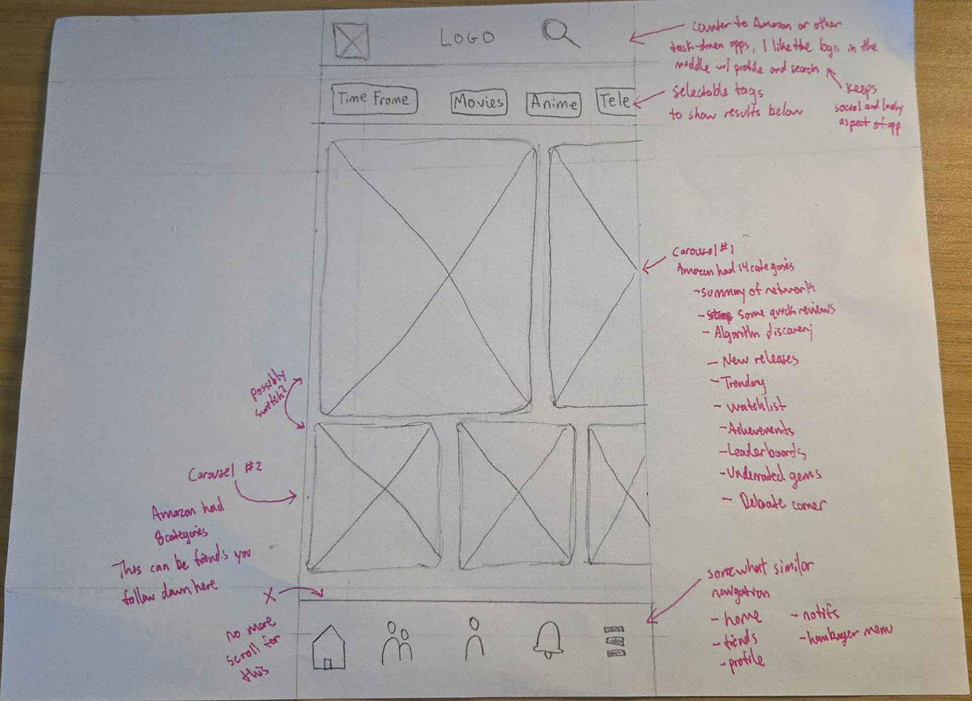
Iteration 4 → Version 0.1
Putting it All Together:
The final design for the first prototype combined elements from Iteration 4 with strategic refinements, supported by established cognitive design principles.
Cognitive Principles Utilized:
Hick's Law: Filters prevent analysis paralysis by limiting displayed information to manageable chunks
Miller's Law: Categorization aids chunking and information retention through clear grouping
F-Pattern Reading: The design follows natural reading patterns with two horizontal carousels arranged vertically
Fitts' Law: Navigation bar button placement directly correlates with importance based on time-to-target
Mental Models: Heavy inspiration from daily-used apps (Instagram, Amazon) minimizes the learning curve for our target audience
Scarcity Principle: Both Discovery and Network Updates carousels create urgency through time-limited content. Top 5 lists are designed to be relevant but non-permanent, introducing a natural decay effect
Reduced Cognitive Load: Unlike Amazon's information-dense interface, Top5 minimizes text and visual noise on each card, helping users maintain focus
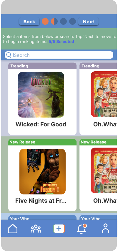
Proposed User Flows: Create a Profile & Create a Top5 List
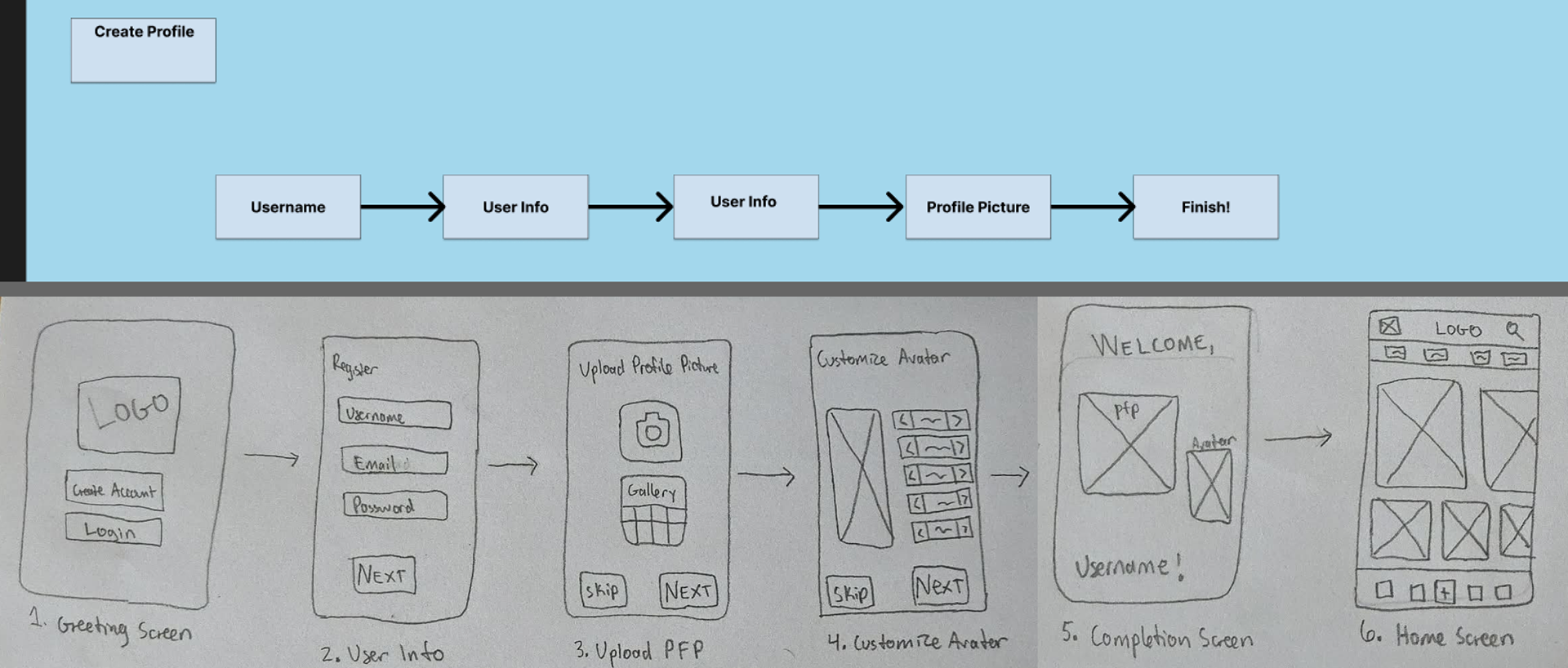
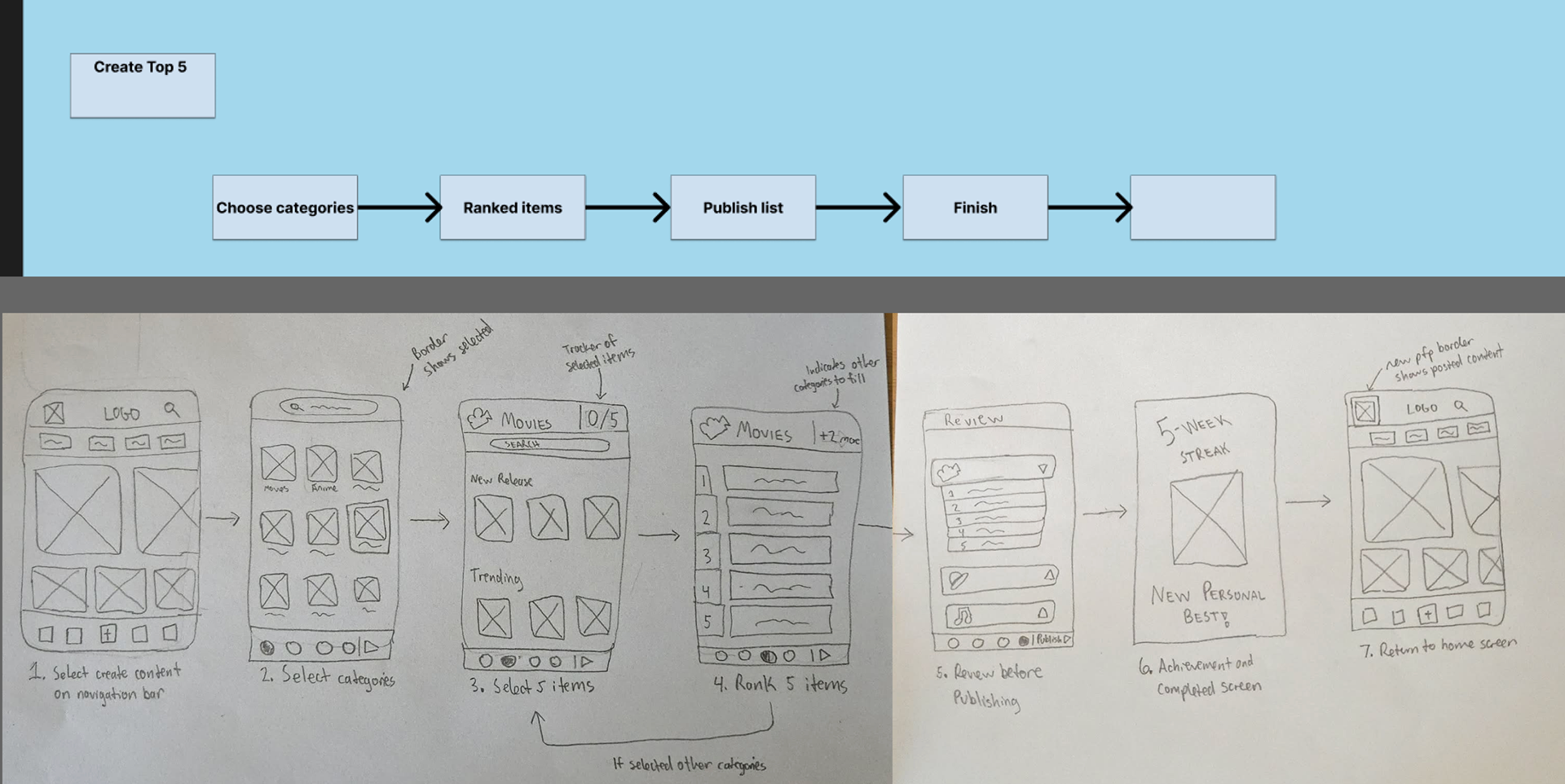
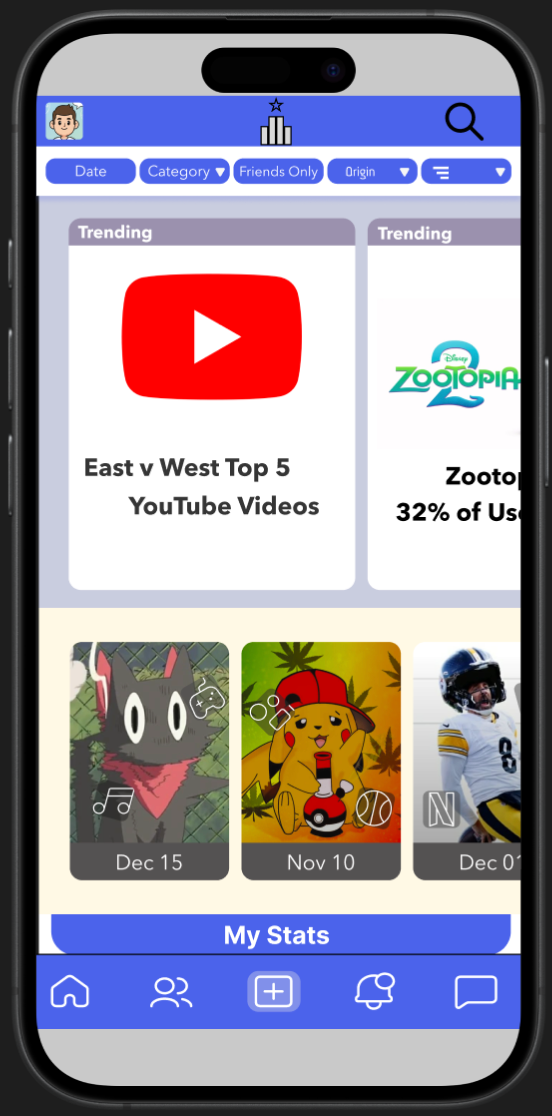
Version 0.1 Prototype Overview
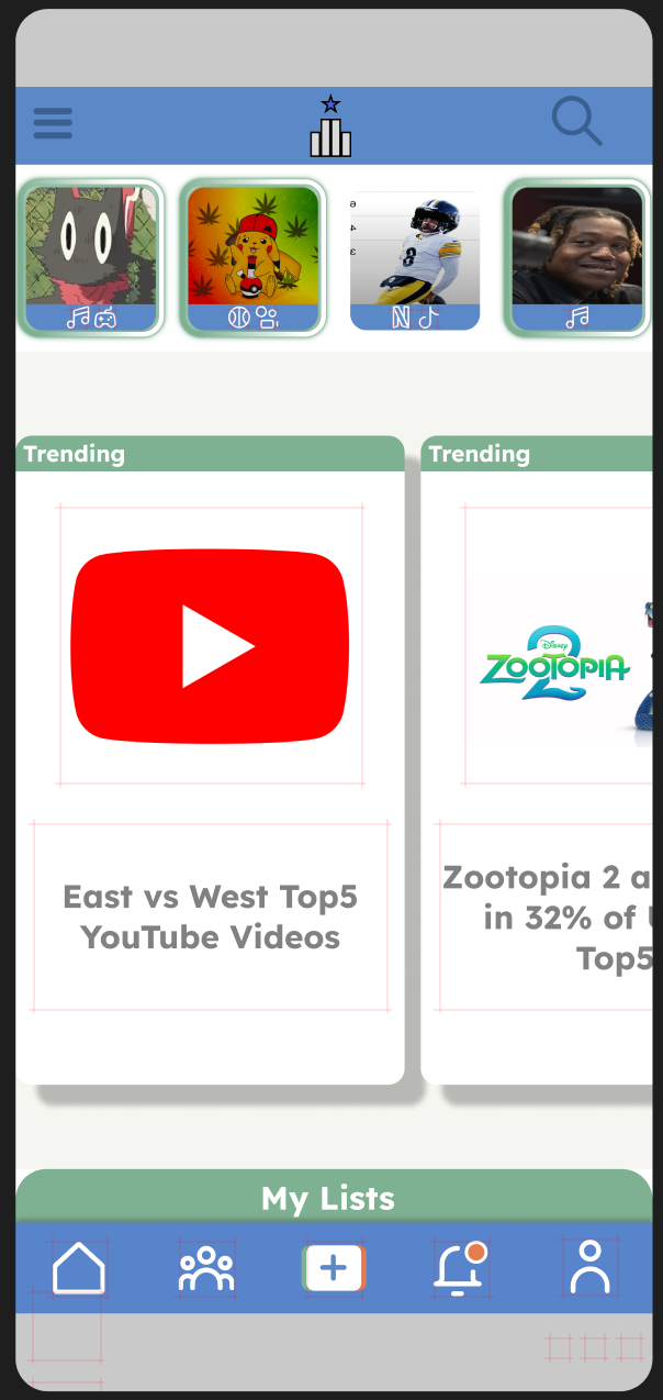
Refinement: Moving on to Version 0.2
Need for an Update
- Version 0.1 validated Top5's core concepts: constraint-based lists, dual-carousel layout, and three-tier content system. -
- Version 0.2 evolved this foundation through systematic refinement across three dimensions: visual semantics (semantic color system with psychological associations), structural consistency (8px grid, unified typography), and research-informed navigation (Profile repositioned based on cross-platform mental models).
This iteration matured the prototype from proof-of-concept to development-ready system with comprehensive component documentation and cognitive design rationale.
Design System
Frost's Atomic Design Inspiration
Structure: Atoms (Components) → Molecules (Functional Groups) → Organisms (Templates)
Component Naming Convention: Section/Screen/Use/Name
Benefits: Scalable, changes propagate automatically, clear documentation
Structure: Atoms (Components) → Molecules (Functional Groups) → Organisms (Templates)
Component Naming Convention: Section/Screen/Use/Name
Benefits: Scalable, changes propagate automatically, clear documentation
Visual Language
Color Palette:
- Primary Blue (#5B89C8) – Trust, reliability (headers, nav, core UI)
- Secondary Green (#7FB092) – Balance, warmth (brand complement)
- Tertiary Orange (#E57C50) – Attention (progress, interactions)
- Semantic List Colors: Gold (Top5/quality), Green (Swap5/neutral), Red (Slop5/negative)
- Accessibility: WCAG 2.2 compliant
- Secondary Green (#7FB092) – Balance, warmth (brand complement)
- Tertiary Orange (#E57C50) – Attention (progress, interactions)
- Semantic List Colors: Gold (Top5/quality), Green (Swap5/neutral), Red (Slop5/negative)
- Accessibility: WCAG 2.2 compliant
Typography:
Lexend exclusively (optimized for readability, reduces visual stress)
Spacing:
8px base grid (4px subdivisions for text alignment)
264×82px standardized Primary Cards
40px text safe zone
264×82px standardized Primary Cards
40px text safe zone
Iconography:
Streamline 10,000 pack (linear monoline, open paths style)
Color adoption for semantic meaning
Color adoption for semantic meaning
High-Fidelity Prototype
Moving From Version 0.1 → 0.2 Evolution
v0.1 Established:
- Dual-carousel layout
- 5-icon bottom navigation
- Three-list system (Top5/Swap5/Slop5)
- Basic gamification
- 5-icon bottom navigation
- Three-list system (Top5/Swap5/Slop5)
- Basic gamification
v0.2 Refinements:
- Color semantics clarified (gold/green/red psychological associations)
- 8px Grid System: implemented for consistency
- Typography: Lexend-exclusive typography hierarchy
- 8px Grid System: implemented for consistency
- Typography: Lexend-exclusive typography hierarchy
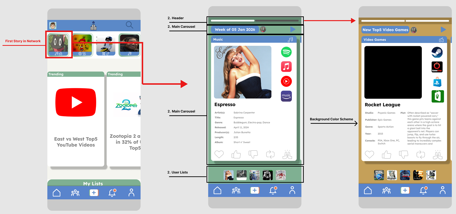
- Story Tray Reposition: Moved above main content for prominence.
- Navigation Refined: Cross-platform analysis showed users expect personal/account functions in the rightmost position, not Forums
- Complete Atomic Design Documentation: A document was created that annotates all design system instructions and reasoning.
- Navigation Refined: Cross-platform analysis showed users expect personal/account functions in the rightmost position, not Forums
- Complete Atomic Design Documentation: A document was created that annotates all design system instructions and reasoning.
- Story Tray Reposition: Moved above main content for prominence.
Research-Backed Navigation Decisions:
- Home (leftmost): F-pattern reading, highest frequency
- Network (2nd): High-frequency connection management
- Create (center): Fitts's Law—equidistant from both thumbs, symbolic emphasis
- Notifications (4th): Engagement driver
- Profile (rightmost): Mental models—users expect personal/account functions here
- Network (2nd): High-frequency connection management
- Create (center): Fitts's Law—equidistant from both thumbs, symbolic emphasis
- Notifications (4th): Engagement driver
- Profile (rightmost): Mental models—users expect personal/account functions here
Key Features & Rationale
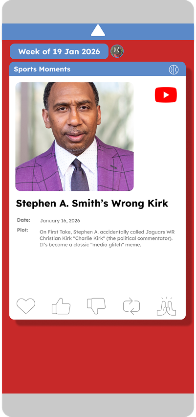
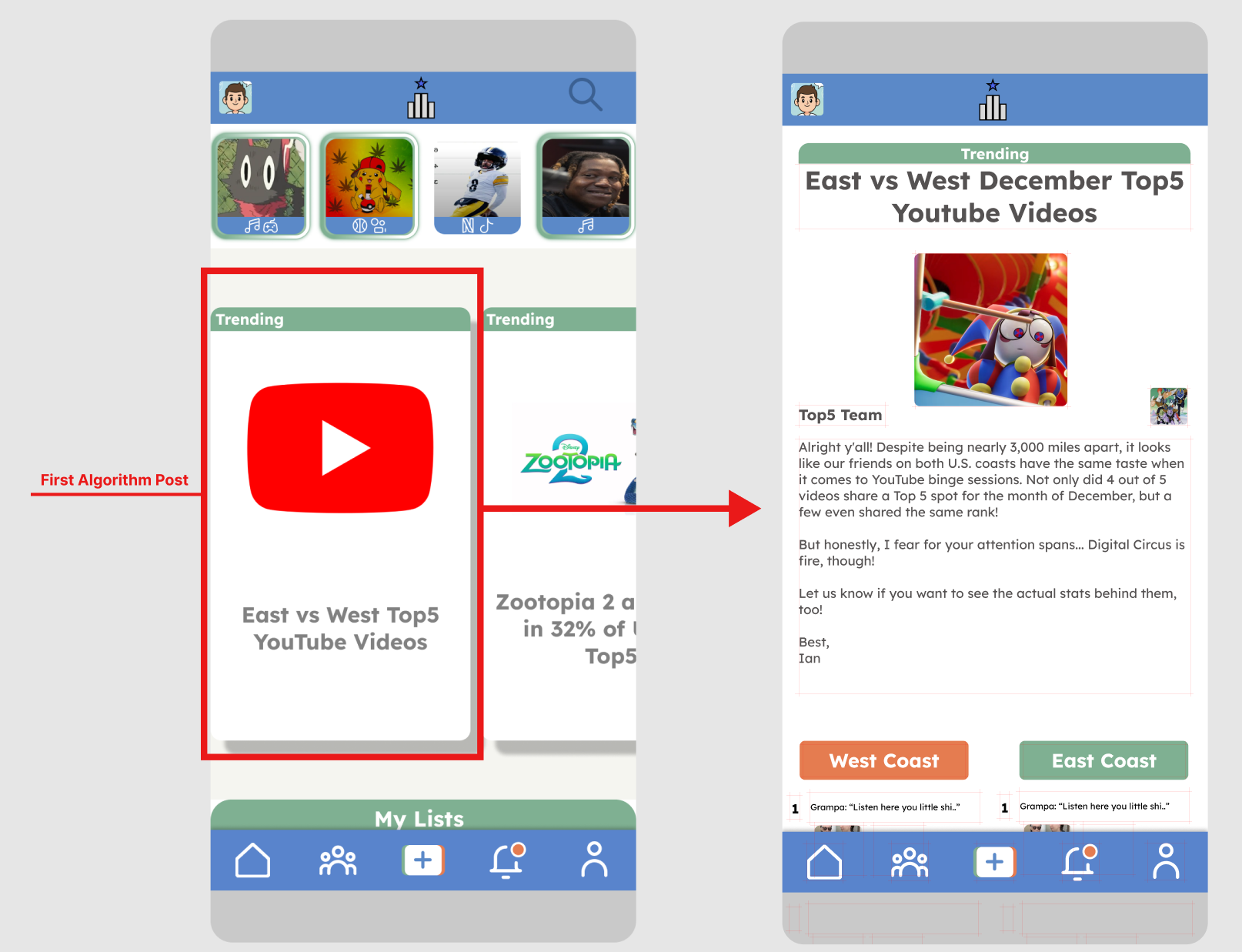
Network Highlights (Story Tray)
Problem: Instagram found 50% of close connections' content was being missed
Solution: Chronological Story format with color-coded rings (gold/green/red)
Impact: Never miss trusted recommendations; time-limited creates healthy urgency
Problem: Instagram found 50% of close connections' content was being missed
Solution: Chronological Story format with color-coded rings (gold/green/red)
Impact: Never miss trusted recommendations; time-limited creates healthy urgency
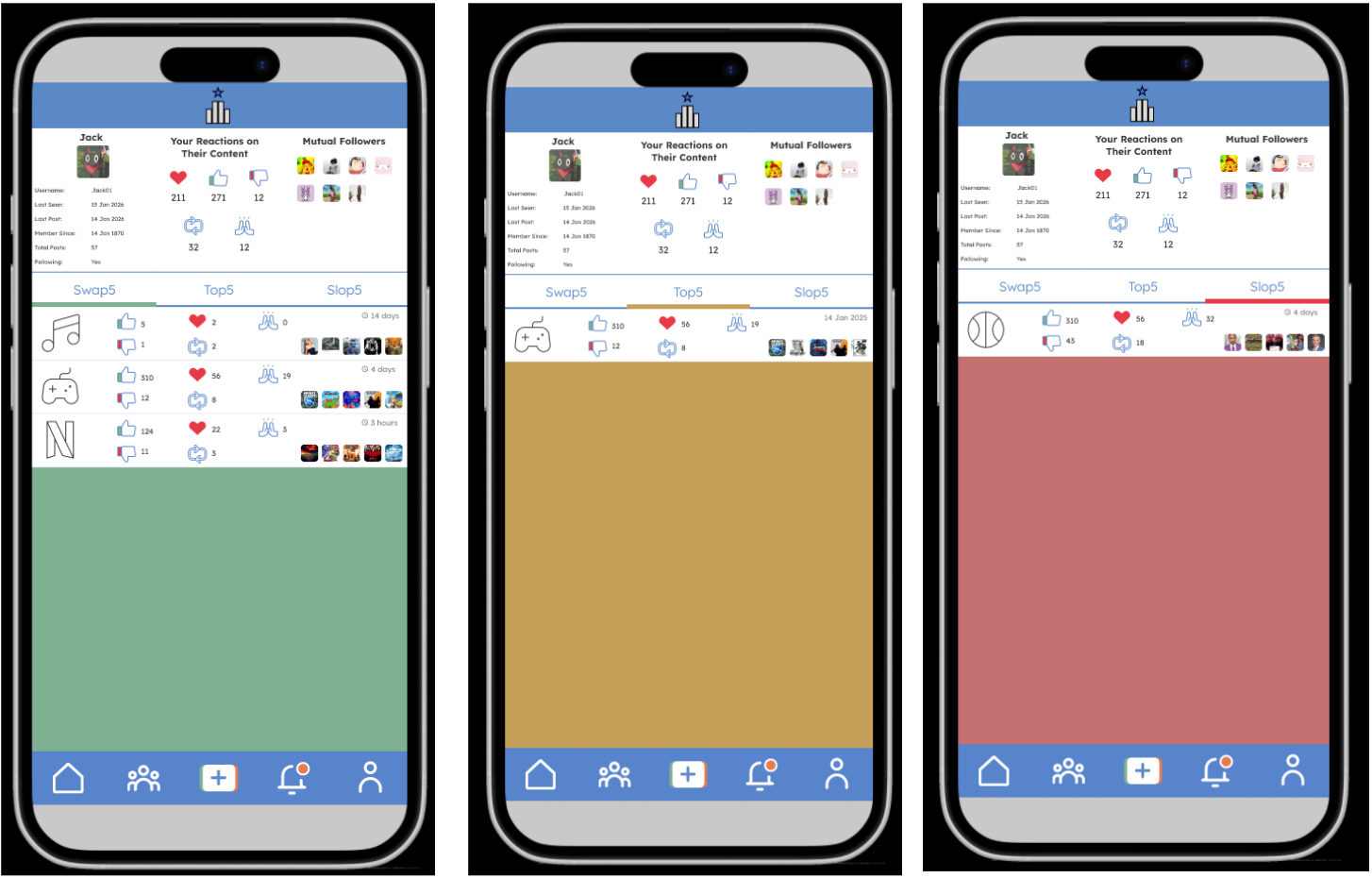
Three List Types
Problem: Users need different recommendation contexts
Solution: Individual lists
Problem: Users need different recommendation contexts
Solution: Individual lists
1) Top5: Evergreen favorites (gold standard, no expiration)
2) Swap5: Comparative "this or that" (time-limited, explores trade-offs)
3)Slop5: Negative recommendations (saves time, avoids disappointments)
2) Swap5: Comparative "this or that" (time-limited, explores trade-offs)
3)Slop5: Negative recommendations (saves time, avoids disappointments)
Rationale: Constraint to 5 items addresses the Paradox of Choice; color coding creates instant semantic understanding
Exploration Over Exploitation
Beneficial Resets: Monthly reset for Swap5/Slop5 creates recurring content creation opportunities: users return to update expired lists rather than "set it and forget it."
Get More For Your Time: Studies link serendipitous recommendations to increased satisfaction and purchase intent vs. predictable suggestions
Serendipity: Research shows users with high content diversity demonstrate better long-term retention than filter-bubble users
Get More For Your Time: Studies link serendipitous recommendations to increased satisfaction and purchase intent vs. predictable suggestions
Serendipity: Research shows users with high content diversity demonstrate better long-term retention than filter-bubble users

Core User Flows
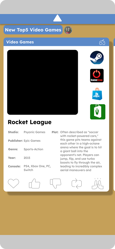
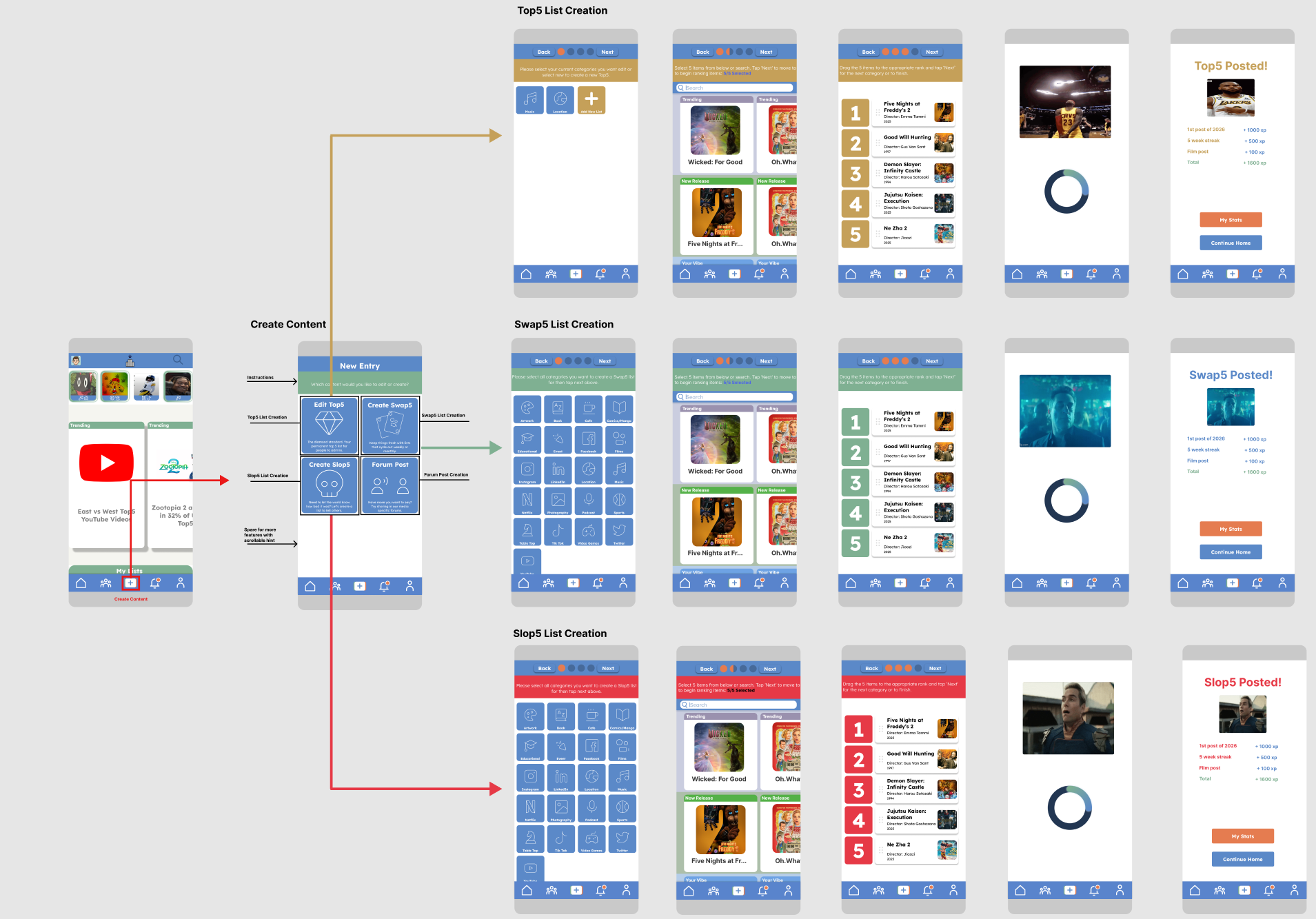
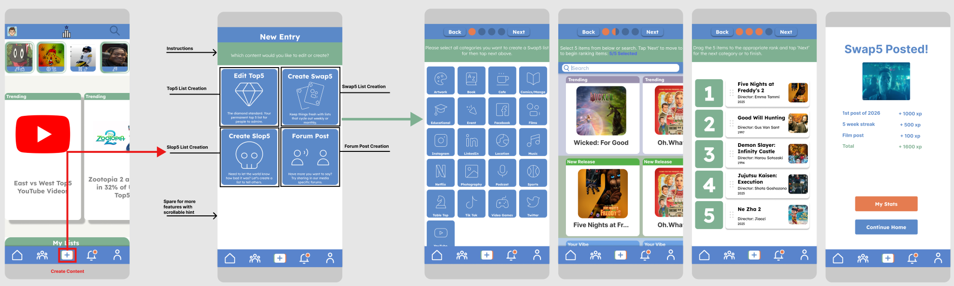
1. Create Content (5 steps)
- Entry selection (Top5/Swap5/Slop5/Forum)
- Category selection (multi-select for batch creation)
- Item selection (3 carousels + search)
- Drag-and-drop ranking (6-dot handle, 32-48px hit zone per Fitts's Law)
- Completion celebration (XP + achievements)
- Category selection (multi-select for batch creation)
- Item selection (3 carousels + search)
- Drag-and-drop ranking (6-dot handle, 32-48px hit zone per Fitts's Law)
- Completion celebration (XP + achievements)
2. Network Story Highlights
- Full-screen story displays 5-item carousel with metadata, streaming links, and scrollable summaries
- User reacts (Loved/Like/Dislike/Repost/"Because of You") and story auto-advances to the next list
- User swipes through items or scans the overview row showing all 5 at once
- User reacts (Loved/Like/Dislike/Repost/"Because of You") and story auto-advances to the next list
- User swipes through items or scans the overview row showing all 5 at once
3. Viewing Users' Profiles
- Access: User navigates to profile via Network tab on navigation bar
- Top Section: View user stats, your specific interactions with their content (not total engagement), and mutual connections
- Bottom Section: Browse their Top5/Swap5/Slop5 lists with preview cards showing stats, temporal info (posted/expiration date), and item glimpse
- Top Section: View user stats, your specific interactions with their content (not total engagement), and mutual connections
- Bottom Section: Browse their Top5/Swap5/Slop5 lists with preview cards showing stats, temporal info (posted/expiration date), and item glimpse
4. Algorithm Recommendations
- Access: User views the Discovery carousel on the home screen, featuring algorithmically recommended content
- Enticement: Cards showing category, user attribution, and item glimpses
- Adaptation: Algorithm adapts based on engagement patterns, prioritizing exploration over exploitation (serendipity > echo chambers)
- Enticement: Cards showing category, user attribution, and item glimpses
- Adaptation: Algorithm adapts based on engagement patterns, prioritizing exploration over exploitation (serendipity > echo chambers)
Usability Considerations
Accessibility:
- WCAG 2.2 compliant color contrast
- Expanded hit zones (drag handles: 32-48px despite 4px visual dots)
- Expanded hit zones (drag handles: 32-48px despite 4px visual dots)
Thumb Zone Optimization:
- Bottom navigation: 62% of users abandon apps with awkward navigation
- 38% increase in interaction when nav moved to thumb-accessible zone
- Right-aligned search optimized for right-handed majority
- 38% increase in interaction when nav moved to thumb-accessible zone
- Right-aligned search optimized for right-handed majority
Progressive Disclosure:
- Step-by-step Create Content flow prevents overwhelming screens
- Progress trackers leverage Zeigarnik Effect
- Preview cards → full details on-demand (profile lists, notifications)
- Progress trackers leverage Zeigarnik Effect
- Preview cards → full details on-demand (profile lists, notifications)
Results & Impact
Deliverables Completed:
- 50-page comprehensive design documentation
- 2 high-fidelity interactive prototypes (v0.1 & v0.2)
- Complete design system with 100+ documented components
- Research-backed rationale for every major decision
- 2 high-fidelity interactive prototypes (v0.1 & v0.2)
- Complete design system with 100+ documented components
- Research-backed rationale for every major decision
Design Innovations:
- Constraint-based design (5-item limit) as core differentiator
- Time-aware content (evergreen vs. decay) matched to use case
- Cognitive framework that prioritizes wellbeing over engagement exploitation
- Semantic color system that communicates without text labels
- Time-aware content (evergreen vs. decay) matched to use case
- Cognitive framework that prioritizes wellbeing over engagement exploitation
- Semantic color system that communicates without text labels
Personal Growth:
- Self-directed end-to-end product design
- Translated psychological research into actionable design principles
- Balanced user needs, business goals, and technical constraints
- Documented design rationale with professional rigor
- Translated psychological research into actionable design principles
- Balanced user needs, business goals, and technical constraints
- Documented design rationale with professional rigor
Reflections & Next Steps
What I Learned
Research Foundation Matters:
Analyzing 17 apps revealed patterns I wouldn't have noticed intuitively—5-icon nav isn't arbitrary; it's validated across platforms for good reason.
Analyzing 17 apps revealed patterns I wouldn't have noticed intuitively—5-icon nav isn't arbitrary; it's validated across platforms for good reason.
Constraints Drive Creativity:
Zero budget forced simpler solutions. The "Space Race" concept was exciting but the task-driven approach created better UX because it matched actual use patterns.
Zero budget forced simpler solutions. The "Space Race" concept was exciting but the task-driven approach created better UX because it matched actual use patterns.
Color as Language:
Semantic color (gold/green/red) reduced cognitive load more than expected. Users don't need labels when color communicates meaning instantly.
Semantic color (gold/green/red) reduced cognitive load more than expected. Users don't need labels when color communicates meaning instantly.
Iteration Reveals Truth:
v0.1's vertical carousel felt right in theory, but user flow analysis exposed the engagement-to-effort problem. Data > intuition.
v0.1's vertical carousel felt right in theory, but user flow analysis exposed the engagement-to-effort problem. Data > intuition.
Future Enhancements
Priority 1: Move Away From Pure White
Current pure white (#FFFFFF) backgrounds can cause eye strain and feel flat. Promote Off-White (#F5F5F0) to the primary background role
Current pure white (#FFFFFF) backgrounds can cause eye strain and feel flat. Promote Off-White (#F5F5F0) to the primary background role
Priority 2: Rethinking the Hamburger Menu
Hidden navigation in hamburger menus feels outdated and reduces feature discoverability.
Hidden navigation in hamburger menus feels outdated and reduces feature discoverability.
Priority 3: Algorithmic Transparency
"Why are you're seeing this?" explanations, feedback controls, confidence scores
"Why are you're seeing this?" explanations, feedback controls, confidence scores
Conclusion
Top5 demonstrates my ability to:
✓ Conduct comprehensive competitive research and extract actionable insights
✓ Apply cognitive psychology to solve real UX design problems
✓ Balance user needs with technical constraints and business viability
✓ Create scalable design systems with clear documentation
✓ Iterate based on evidence rather than assumptions
✓ Think holistically about product strategy, not just visual design
Core Philosophy:
Design should strengthen human connection, cut through noise, and respect users' time, not exploit attention for engagement metrics.
Version 0.1 Demonstration
Version 0.2 Demonstration