Inclusive Design: Crunchyroll
Role:
Secondary Research, Redesign & Stakeholder Delivery
Overview:
An inclusive design approach to Crunchyroll's home screen.
A prototype was developed based on a secondary research-supported persona, and visual impairment violations identified through WCAG and common practices.
(Not an official partnership with Crunchyroll, used for a class project)

Background
About Crunchyroll:
Popular streaming platform that specializes in anime, manga, and other Asian media content. It offers a massive library of anime series, movies, and simulcasts (episodes released shortly after they air in Japan).
Notable Statistics:
-Over 1,000 anime with +50,000 episodes
-Multiple collaborations and produce their own anime.
-Since July 2020, a 5x increase in subscriptions with steady growth year over year
-Currently 15 million subscribers as of June 2024
Concerns:
-Relies heavily on visual displays to attract customers
-Continuous expansion to become a one-stop shop for anime as seen by: (1) Partnership and merger with Funimation in 2024, (2) Standalone channels on Amazon Prime and Pluto TV
Goal:
Create an optional inclusive design-influenced accessibility menu where users of visual concerns can tailor their experience.
Timeline

Secondary Research
Visual Impairment:
8% of Americans suffer from some form of visual impairment, yet anime is still highly regarded as an accessible medium since it offers episodic storytelling driven by sound cues, expressive voice acting, and detailed soundscapes.
Of those with visual Impairment:
-96% still watch TV regularly (with 55% nearly as much as the general public at ~4 hr/day)
-53% have trouble following along with key visual elements, something anime heavily relies on.
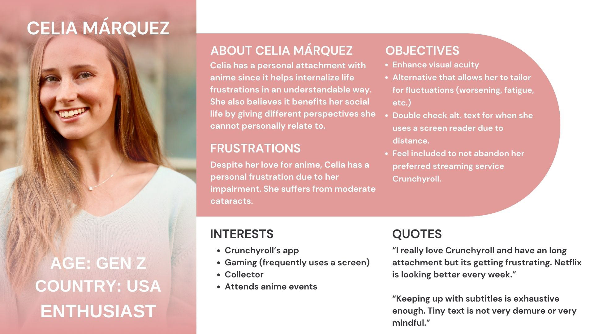
Persona
After a visual impairment and platform were determined, a persona needed to be specified for Crunchyroll.
The visual impairment of low-vision was used for the persona development.
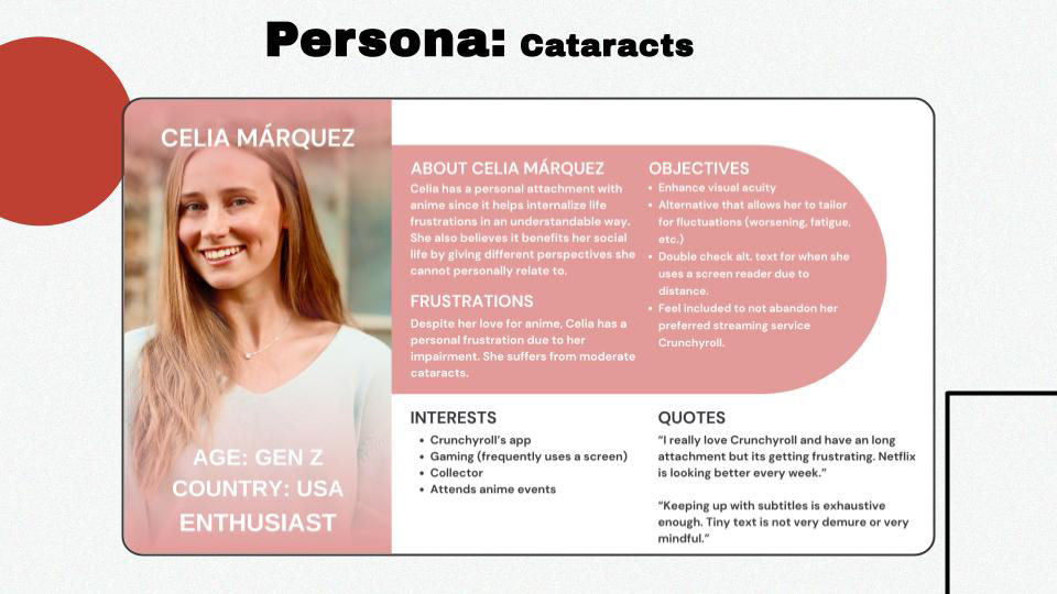
Celia Marquez was the finalized persona developed from the information gathered during the secondary research phase.
This allowed for a targeted goal when developing the prototype and where to focus my attention when highlighting violations within the Crunchyroll home page.
Reason for Redesign
A Need for a Redesign:
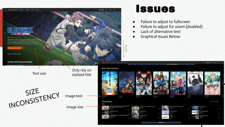
While visually appealing, Crunchyroll prioritizes graphical excitement over readability which poses challenges for users with visual impairments.
Key issues included:
-Anime-specific stylized titles
-Visual inconsistencies that hinder interpretation.
-WCAG 2.0 violations
A Reason for a Redesign:
If Crunchyroll aspires to be the ultimate one-stop shop for anime, it must prioritize the needs of its entire user base as it seeks to serve a more inclusive audience. It's clear those with a visual impairment still account for a significant portion of the streaming industry
WCAG & Best Practices Violations
Relevance:
Both Google Lighthouse and Accessible Web Helper were used to analyze errors within the homepage.
Celia’s objectives helped identify other key concerns outside of WCAG guidelines, such as best practices.

Prototype
Inspired by the industry standard accessibility menu that is typically offered to users near the bottom of a website. Some common features were carried over to this proposed redesign with an emphasis on meeting Celia's needs.
View the GIF below and the actual prototype Here!


Changes for Celia (Persona)
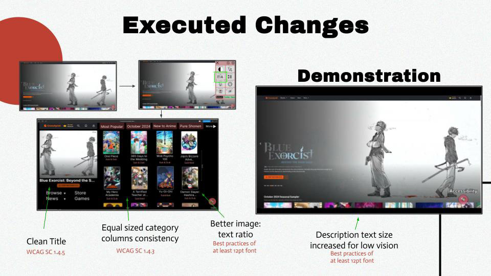
Legible Title:
Allows for clear interpretation.
The prior format was visually appealing but created trouble for identification, especially since Celia happened to be a fan of Blue Exorcist but was unaware of a new season.
Better Column Organization:
The inconsistent sizes between categories deter intrigue and create a need for Celia to constantly alternate her zoom.
Now all categories are evenly displayed in columns.
Equal Sized Image & Text:
The anime title gives just as much context as its image.
In some categories, such as Top Picks for You, the text size created another zooming fiasco to read each one.
Now Celia no longer has to fiddle with her zoom to read titles!
Anime Description Text Size:
Before the redesign, Celia had to hover her mouse over an anime to see a description that was the same size as the smaller titles. Even worse, the smaller displayed categories didn’t have an option to readily see a description.
Now with each click, a larger text box appears allowing Celia to read every anime’s description and not have to adjust her screen.
Presenting the Findings
Conclusion & Future Steps
Conclusion:
Lessons Learned:
(1) It is difficult to encompass the spectrum of just one impairment. This is exacerbated by a lack of formal literature on how to properly address these issues through design practices.
(2) Crunchyroll is fairly challenging even for someone with ‘normal vision.’ Inclusive consideration is highly recommended.
Key Takeaways:
(1) The initial goal was delivered but moderate areas for improvement are noticeable.
(2) Provide a better solution to display the accessibility menu. Although low-vision was the focal impairment for this project, the menu aimed to assist all visual concerns. Based on its location, someone with peripheral vision loss may overlook it.
Usability Testing:
The ideal next step would be to conduct usability testing to assess these proposed changes.
Since there is a lack of standardized best practices to include users with low vision, this testing could support findings that benefit the UX field.
Further Development:
The current prototype only simulates an equitable image to text ratio option.
To properly assess the benefit for those with low impairment, all options provided in the accessibility menu would be developed.